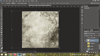
I'm going to quickly demonstrate some of the processes I like to go through when editing, I'm mostly self taught since a lot of my favourite designs, including the design below (which is acting as a backing template for all my digipak covers) are happy accidents that I like to recollect on and try to work out again.
First I started off with a nice floral background image, which I discussed before hand with the band on the idea of the floral style. This was one of the nicer images, I played around with a tiny hue effect, but other than that it is the same copyright free stock image.
I then duplicated the layer and went into the effects options, had a look through some different things. I used (in the effects list) Effects : Pixelate : Crystallize. Then went into the effects panel and applied the 'accented edges' filter, which applied the effect seen to the side. Then changed the above layer to an opacity of 50%
Next I changed the hue of one more floral stock image, this time reconnecting the rennaiscance theme that I discussed with the band. Changing the hue to black and white, completely de-saturated using the hue and Brightness/contrast filters.
I then applied this layer over the top of the other two layers I had previously finished and in the lighting settings (seen to the right of the image, by the layers) I chose "hard light" which gave it back it's colouring from the other layers, whilst leaving a detailed and engraving style look on the cover.
Lastly I changed the Brightness and contrast again of the second layer (with the accented edges) and changed it to the settings above, this gave it a nice themed and darkened tone. I'm now using this as a background image for all my digipak covers.
 I first started with the backround template that I had originally created then began to add other layers that had relation to what the band were designated about.
 I applied a simple image over the top that I cut out with the Polygonal Lasso tool and then applied it with an 'Overal' lighting effect (above the layers on the right)
 I then placed a few more items that the band wanted whilst using various layer lighting effects, on top of also adding a set of light flares from a free brush pack I found, I liked being able to use the gaussian blurs on the flares to really push a continuity in the image.
 I then added some paint splatters in a placement of where I hoped for the EP title text to go, using the layer effects of "Hue" and "Luminosity".
 Lastly I added the text which has a continuous font for both the Frame Of Mind and Paragon titles, but a seperate and more hand drawn text for the Windows EP title, this is because the band wanted to give a more "Sketch" and "draft" feel to the musical work.


