In what ways does your media product use, develop or challenge forms and conventions of real media products?
My media products were built together off a singular branding and so I feel that I had a stronger bond with each product. However the styles used within them are challenging regular statements made by the usual product manufacturers.
My products consist of a Music Video developed to fit an original song for the band Frame Of Mind. A digipak to fit there newest set of song releases, in the form of an EP, including the song with the music video. A poster and set of banners to use for social advertising. And a new logo/rebranding for the group.
To start here are the final branding images which include a full shot of the front, back and logo cover pieces.
Overall one thing that I found really strange which is something I'd never considered in my own mind with these new cardboard and vinyl cut packs is that they're not actually completely square. This meant that three pieces I had made had to be resized and changed accordingly to suit the pack.
I tried my best to work in line with criteria, though we hadn't been set any other than the specific products, I wanted to gain a criteria from the band. So I began to work with the ideas they had.
The terms they gave me that they wanted to fit their album covers were "rustic", "Handwritten" and "tree like" designs. So I still had a graphic set and idea to appease to, I found that this actually helped my work a lot! However I still tried many different image styles and brought the designs to the band to find out which way they wanted the album cover art to develop towards.
 All of these designs had a floral feel to them, some more than others, however the image to the right and above were too coloured for the bands liking, and too 'future' for the style of music.
So the band is now using the logo to the right for their social media, and above for the disc packaging.
When I brought this back cover design back to the band it seemed a bit silly since they hadn't chose their track titles yet! however I wanted to keep the 'handwritten' theme and try and continue the rustic feel of the front cover, whilst making the track titles more visually interesting.
I kept the table and floral design from the front because I loved the idea of having an almost running theme with the packaging.
I also worked on incorporating the 'FOM' watermark and the production companies watermark branding. The band said they were fine with this,
 A lot of my style models that I wanted to use as reference had not really tried the style of art that I was going for. So I had to go out on a limb by using it. however a lot of the packs I sought to reference that I own were three piece packs (as seen to the right) that contained multiple booklets.
And the disc design was different from the artwork everytime.
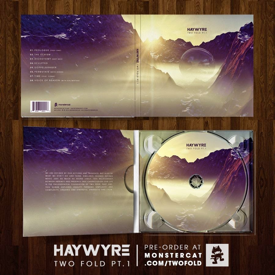
After searching through my CD collection I managed to find one that was a perfect digipak type and art style. Where the art is continuos through the piece and the CD.
Overall one thing that I found really strange which is something I'd never considered in my own mind with these new cardboard and vinyl cut packs is that they're not actually completely square. This meant that three pieces I had made had to be resized and changed accordingly to suit the pack.
I tried my best to work in line with criteria, though we hadn't been set any other than the specific products, I wanted to gain a criteria from the band. So I began to work with the ideas they had.
The terms they gave me that they wanted to fit their album covers were "rustic", "Handwritten" and "tree like" designs. So I still had a graphic set and idea to appease to, I found that this actually helped my work a lot! However I still tried many different image styles and brought the designs to the band to find out which way they wanted the album cover art to develop towards.
 All of these designs had a floral feel to them, some more than others, however the image to the right and above were too coloured for the bands liking, and too 'future' for the style of music.
So the band is now using the logo to the right for their social media, and above for the disc packaging.
When I brought this back cover design back to the band it seemed a bit silly since they hadn't chose their track titles yet! however I wanted to keep the 'handwritten' theme and try and continue the rustic feel of the front cover, whilst making the track titles more visually interesting.
I kept the table and floral design from the front because I loved the idea of having an almost running theme with the packaging.
I also worked on incorporating the 'FOM' watermark and the production companies watermark branding. The band said they were fine with this,
The final cover actually went through a good few different stages, a lot of props within the photo were way too big, stood out too much and weren't really aiding the minimal aestheticism. when I brought the first cover version to the them they asked if they could see the title piece a bit more clearly, so I decided to add some additional glow and shadow effects, with abstract paint splashes. each using different lighting effects. However I thought it may be a bit too 'future' again, but it was the exact opposite... They loved the style and asked me to import it into the other designs. (you can see it in the design above the front cover).
The ways in which my digipak challenges your typical digipak conventions is by the way in which I've placed a lot of the items (you can see it in the full template above).
 A lot of my style models that I wanted to use as reference had not really tried the style of art that I was going for. So I had to go out on a limb by using it. however a lot of the packs I sought to reference that I own were three piece packs (as seen to the right) that contained multiple booklets.
And the disc design was different from the artwork everytime.
After searching through my CD collection I managed to find one that was a perfect digipak type and art style. Where the art is continuos through the piece and the CD.
My digipak challenges the conventions of the Linkin Park digipak because of how it uses the same picture for a cd design and because rather than having a inlet booklet, mine only has a sheet with social media links for the fans, and the band information is within the actual packaging artwork.
For a large in depth overview of all the graphics that I have made and it goes into more detail and assesment of the items I produced, so do have a quick watch of this presentation you can find on a previous post here. http://oa2mediajasonsmith.blogspot.co.uk/2015/05/graphics-evaluation-prezi.html


.jpg)
.jpg)

No comments:
Post a Comment